BRABANTIA'S NEW COLOURS PUT YOU IN THE MOOD!
Posted by Brabantia on 14th Apr 2022
Posted by Brabantia on 14th Apr 2022

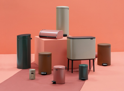
Brabantia introduces four new trend colours: Terracotta Pink, Pine Green, Mineral Cinnamon and Champagne. But how were these colours chosen? And what do they stand for? Let’s ask Twan Verdonck, Creative Director at Brabantia.
“The right colours can help you turn chores into a ritual. You spend many years of your life doing chores, and nobody really likes it – but if you can use smart products with beautiful colours and prints, it will lift your spirit. Colours also affect your mood, each of our new colours gives you energy in a different way.”
“We visited many international design shows and studied the forecasts of the trend watchers. With the entire design team, we gave our own Brabantia-spin to the ideas we saw. Then we decided on themes. Each colour puts you in a different positive mood.”
“The Brabantia colours that put you in the mood. They can help you turn boring chores at home into a pleasant ritual.”
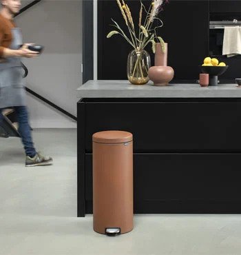
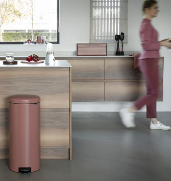
“This colour is about positivity, about keeping both feet on the ground. We are online all the time and so busy both physically and mentally, that grounding is very important. People need to literally feel the earth, by gardening or walking barefoot outside. So we came up with this ‘earthy’ colour. Terracotta Pink is perfect in a kitchen with light colours and wood. It gives a blush to your interior but is not super bright. Moreover, it is also a cosy colour and it feels Mediterranean, like a little vacation."
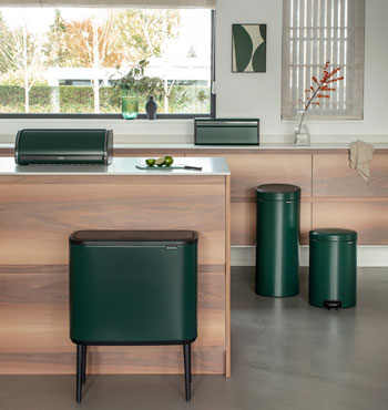
“This colour lets you feel the serenity of nature. It is inspired by a pine forest, where you can completely relax. Pine Green is very beautiful in both light and dark interiors. The colour also combines beautifully with wood and other greens, nice if you have a lot of plants in your home, for example. It is a cool colour, which is beautiful in a Scandinavian interior. We first wanted to go for a light green colour, but we eventually opted for dark. And it is very popular.”
“Mineral Cinnamon is about being strong and showing guts. It is a rust-coloured pigment, which goes fantastically with an industrial style. I can also picture it in a characteristic loft apartment. It is quite an exciting colour: and it has a lovely texture. We notice that everyone wants to feel it immediately.”
“Champagne brings a sense of luxury and energy to your home. It is completely on trend with the wellness and hotel interior feeling that you see in homes nowadays. Bathrooms become a kind of "spa at home". Bedrooms are also more often styled as a kind of luxury hotel room. Our stainless-steel line is popular, and we have now added a touch of champagne colour. It is especially beautiful in dark-coloured bathrooms and rooms. Then the Champagne really pops. It brings energy, like a sunbeam. Tip: create an exciting contrast and combine with black tones or dark grey!”